Viewing Desktop Websites on an Android Device: How To
 |
Most websites have a mobile-friendly version that can efficiently run on Android devices like mobile phones or tablets. These versions adjust to the viewport and are optimized for Android devices. However, as discussed below, you may want to switch back to a full-fledged desktop version of the website for various reasons.
When does the desktop version of a website prove beneficial over its mobile version?
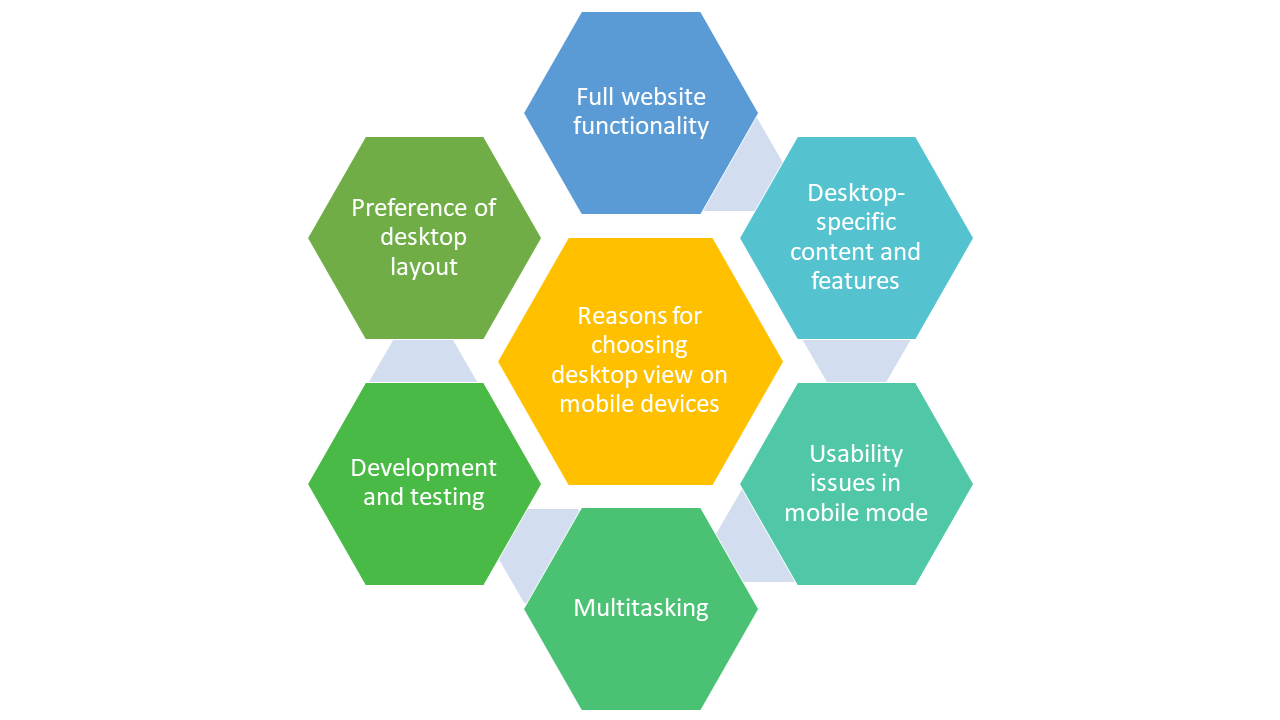
One might think that mobile versions of websites are all needed due to the popularity and ease of using mobile devices. Mobile websites are often designed to be streamlined and provide essential functionality, but they may lack certain features available on the desktop version. Users might want to access these additional features for a more comprehensive experience. For example, when accessing a project management tool like Trello on your Android device, you might prefer the desktop view to access advanced project management features.
Though most websites have a mobile-friendly version, some websites might still not be compatible with mobile devices and render incorrectly on mobile browsers. This is especially true for websites that rely heavily on complex layouts, scripting, or plugins. In some instances, mobile versions of websites may not provide access to all of a website’s content, like certain documents, files, or media that are only available through the site’s desktop version.
Not everyone is comfortable using mobile versions of websites, with some users simply prefer the layout and navigation of the desktop version. They may find it more user-friendly or better suited to their needs, especially if they have experience with the desktop version on a larger screen.
How to switch to the desktop version of the website on an Android device?
If you are looking for the desktop version of a website on your Android device, you can easily do so by requesting the same through your mobile browser‘s settings. Illustrated below is an example of how you can achieve this if your browser is Google Chrome.
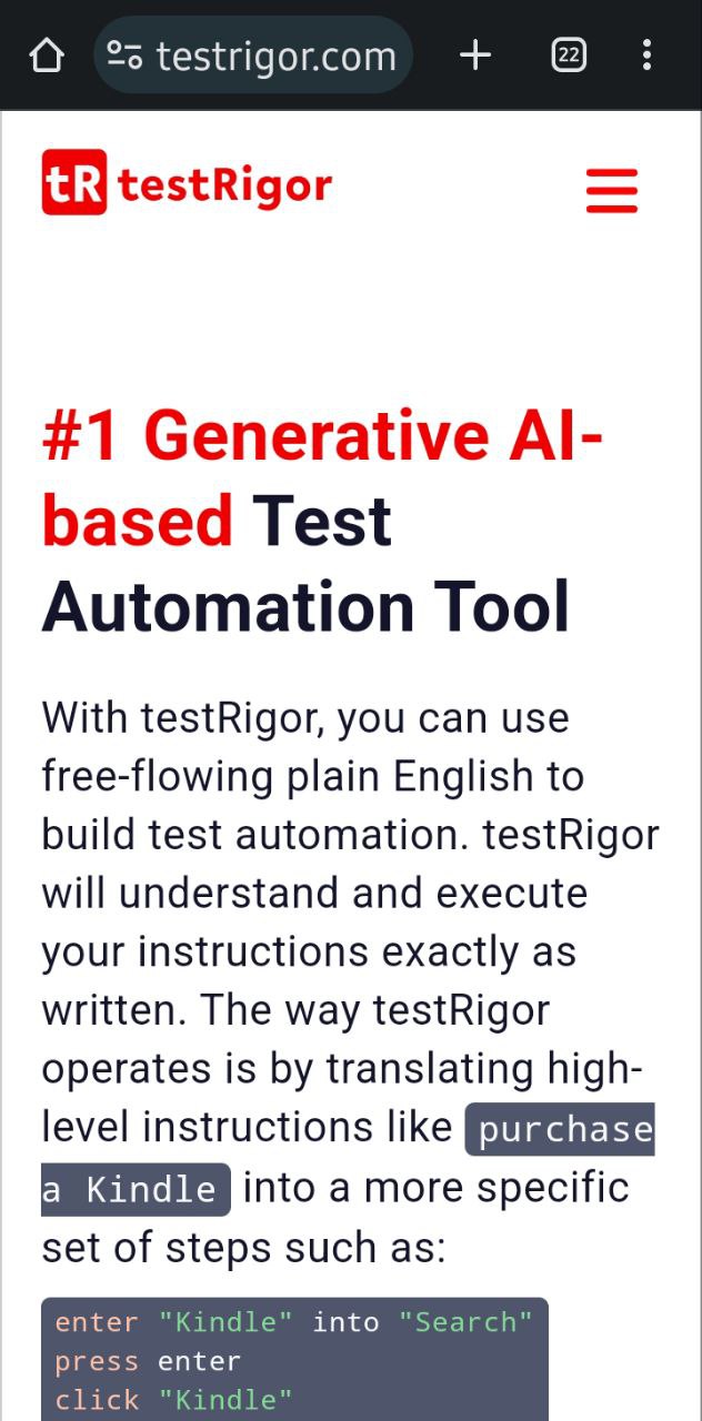
Step 1: Open your mobile browser, in this case, Google Chrome, and navigate to the website you intend to work on.
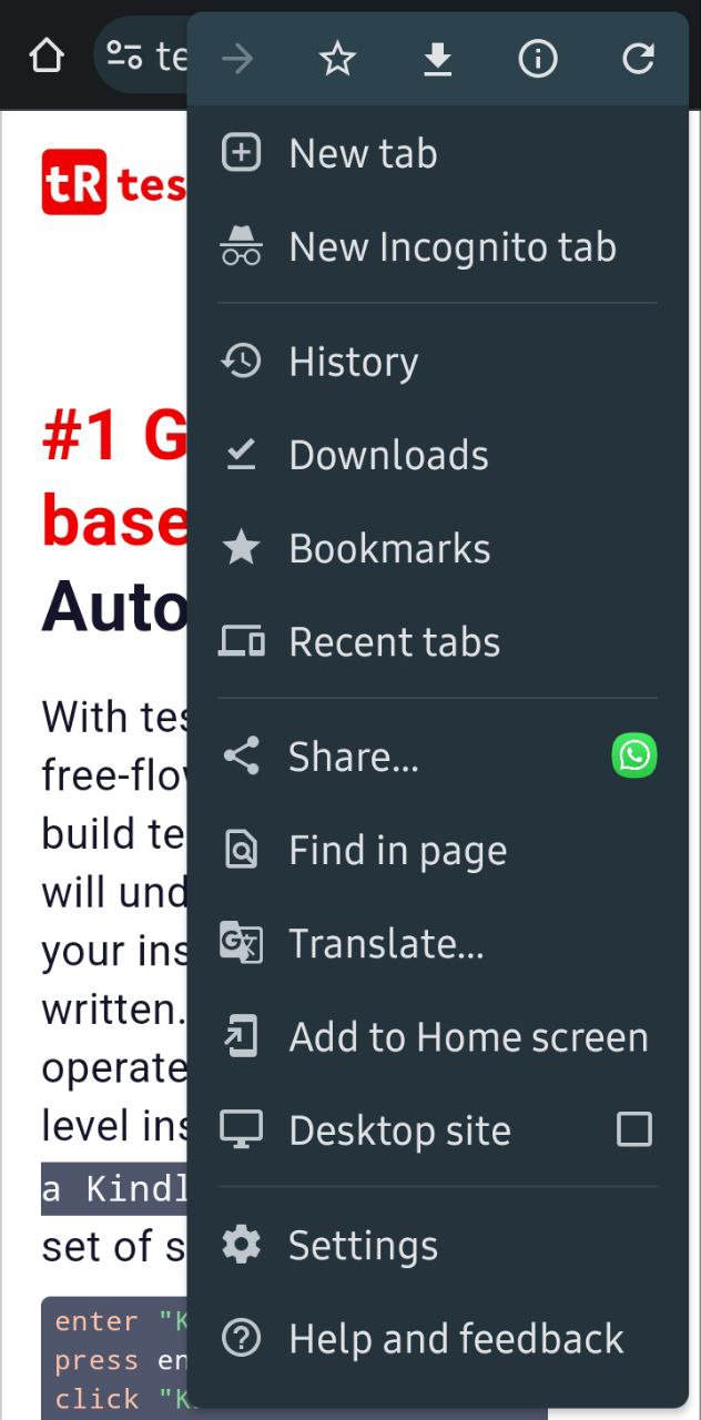
Step 2: In the browser header, the kebab menu (three dots) represents other menu options. Tap on it and look for Desktop Site. Select this checkbox.
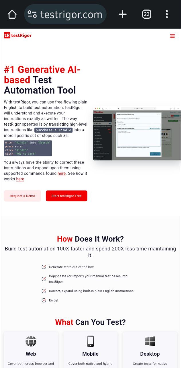
Step 3: The tab will automatically reload once you select this option to show you the desktop view of the website.
If you wish to return to the mobile version, uncheck the checkbox, and the browser tab will reload automatically. Here is a detailed blog on how to start mobile testing.
To sum it up
As convenient as it is to use Android mobile devices, you no longer need to sacrifice the capabilities of the desktop version of websites and settle for the lighter and compact mobile versions. You can switch between website versions by looking for the Desktop Site option in your mobile browser’s settings menu. For larger mobile devices like tablets, there’s a chance that your website will load in desktop mode only, so you won’t need to worry about that.
| Achieve More Than 90% Test Automation | |
| Step by Step Walkthroughs and Help | |
| 14 Day Free Trial, Cancel Anytime |


