Mobile First Design Testing – How to Guide
 |
“Over 61.5% of global internet traffic comes from mobile devices.”
Not surprising, right? From the moment we wake up till our last “good night”, we use our mobile phones, so much so that some use the mobile phone’s alarm and bedtime reminders to track their circadian rhythm!
When it comes to the internet, you no longer have to wait to log into your desktop computer. Mobile devices are at your fingertips. You can easily surf the net for any website or open an app on your mobile phone for the same.
But here’s the catch – if you’re the mastermind behind creating those websites and apps, you are probably under tremendous pressure. Your application needs to be available at all times (what if someone prefers midnight scrolling?), perform well, be safe to use, and appear attractive enough. All this in a highly competitive market with too many appealing alternatives waiting to bait your customers away from you.
“If a page takes over 3 seconds to load, 53% of mobile users will abandon it.”
Thus, you not only need to design your application in a way that is super adaptable for mobile devices, but also make sure that it sells. You can do this with a mobile-first design and then adopt the right strategies to test it.
Key Takeaways
Here are the main key takeaways from this article:
- Mobile-First Is Essential: With the tremendous traffic from mobile devices, designing for mobile first ensures the best user experience for the majority of users. It’s about starting small and scaling up.
- What Is Mobile-First Testing? This testing ensures your mobile version works smoothly under real-world conditions, including touch interaction, network speed, and limited resources.
- Mobile vs. Desktop Testing: Mobile-first testing focuses on small screens, touch inputs, and slower networks, unlike traditional desktop testing, which assumes high power and fast connections.
- Key Testing Techniques: Use a mix of manual, automated, visual regression, performance, and usability testing to cover all aspects of mobile-first design quality.
- What to Test: Check for performance, responsive layout, touch gestures, navigation flow, accessibility, battery use, cross-device behavior, and network handling.
- Setting Up the Environment: Simulate different devices, screen sizes, and network speeds using emulators, real devices, and cloud platforms to catch hidden issues.
- Why Use testRigor: Learn how testRigor simplifies mobile-first testing with natural language test creation, AI-powered visual checks, accessibility validations, and low maintenance.
What is Mobile First Design?
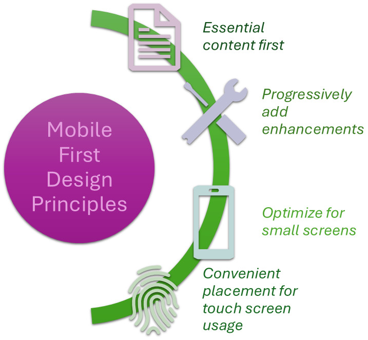
Mobile-first design is a design approach in which you start by creating a version of your website or app for the smallest screen, that are mobile devices, and then expand it to work on larger screens, like tablets and desktops. The idea behind this approach is to prioritize the mobile user experience because, in today’s world, more and more people access the internet through their smartphones.
Think of it like building a house: you start with a solid foundation, then build up from there. In the case of websites, that “foundation” is the mobile design, which has to be simple, easy to navigate, and fast. Once you get that right, you can scale up to bigger screens, adding extra features that make sense for larger devices.
Here’s how it works…
When creating a website or app using the mobile-first design approach, developers start by designing it for small screens (like phones). Then, they scale it up to work on bigger screens. This is different from the traditional approach, where developers would start with the desktop version and then adapt it for mobile devices.
Why Mobile First?
The reason why this approach is so important today is that mobile usage has skyrocketed. People are using their phones for almost everything – shopping, social media, banking, entertainment, and more. By designing for mobile first, you’re ensuring that your website or app delivers a seamless, enjoyable experience for the majority of users who are on their phones. This way of app designing is helpful for SEO rankings.
This mobile-first strategy also helps with website performance. Mobile devices have limited screen size and often slower internet connections, so the design has to be lightweight, fast, and easy to use. When you start with mobile-first, you’re forced to think about what’s really important, eliminate unnecessary clutter, and focus on what matters most.
What is Mobile First Design Testing?
Mobile-first design testing is all about making sure that the mobile version of your site or app performs well. Along with that, you’d also want to see if your design can adapt across different devices and still function as the user would want it to. You need to understand the psyche of the user, figure out what they’d want to see, or what functionalities would they want easily accessible.
How is Mobile First Testing Different from Traditional Desktop Testing?
Mobile-first design testing is all about making sure your website or app works perfectly on smaller screens with touch interactions, slower networks, and limited resources. On the other hand, traditional desktop testing focuses on ensuring that everything functions well on larger screens with mouse and keyboard interactions, faster connections, and more processing power.
| Aspect | Mobile First Design Testing | Traditional Desktop Testing |
|---|---|---|
| Screen Size and Layout | Focuses on testing for smaller screens. Ensures content fits well and adapts to both portrait and landscape modes. | Focuses on larger screens. Ensures content looks good on big displays and works well when resizing the browser. |
| Interaction Method | Tests touch interactions (tapping, swiping, pinching, etc.). Ensures buttons are large enough for easy tapping. | Tests mouse and keyboard interactions (clicking, hovering, using keyboard shortcuts). |
| Performance Considerations | Tests for slow internet connections and ensures the site loads quickly even on 3G or weaker networks. | Assumes faster internet speeds and more powerful processors. Load time and performance testing are important, but less critical. |
| Battery Life | Focuses on how the website or app affects battery usage, especially when resources are heavy. | No concern about battery life, as desktops are plugged in. Focuses on speed and functionality. |
| Responsive Design | Ensures the design works across multiple screen sizes, starting with mobile as the base design. | Ensures content looks good on larger screens, but the primary concern is large display optimization. |
| Network Speed and Conditions | Simulates various network conditions (e.g., 4G, 3G, offline) to test performance under different scenarios. | Primarily tests for fast, stable network connections. Slower network conditions are less of a focus. |
| User Context | Tests for usability on the go, with considerations for distractions, one-handed use, and location-based services. | Assumes the user is seated at a desk, focused on the task. Less concern for distractions or mobile-specific features. |
Different Testing Techniques for Mobile First Design
You’ll need to include the following types of testing to make sure that your application meets user standards.
- Manual Testing: The tester manually inspects the different features, buttons, and user flows to ensure everything works as expected. This can help identify usability problems that automated tests might miss, like poor user experience or design flaws. Read: Manual Testing: A Beginner’s Guide.
- Automated Testing: Automated testing involves using tools to test the app without human intervention. With these tests, you can speed up the testing process and ensure consistency, as it is great for repetitive tasks like testing login forms or navigation links across multiple devices. With intelligent tools like testRigor, you can do a lot more.
- Visual Regression Testing: It is used to check if any changes to the website’s code have unintentionally affected its appearance, especially on mobile screens. This helps ensure that the mobile-first design remains visually consistent across different versions of the site, even after code changes. Read more: Visual Regression Testing.
- Performance Testing: This checks how well the mobile site or app performs under various conditions, including slow network speeds and limited device resources. Mobile devices often have slower internet speeds and limited processing power, so performance testing ensures the site or app works smoothly even in challenging conditions. Read: What is Performance Testing: Types and Examples.
- Usability Testing: Involves real users testing the site or app to see how easy and intuitive it is to use. This technique helps uncover problems with navigation, user flows, and interactions that might not be obvious to developers or testers. Read: Automating Usability Testing: Approaches and Tools.
- Cross-Device Testing: Mobile devices vary widely in terms of screen size, resolution, and operating system. Cross-device testing involves checking how the website or app performs on different types of mobile devices (smartphones, tablets, etc.) to ensure consistency and functionality.
- Accessibility Testing: Checks if the mobile website or app is usable by people with special needs, such as those who use screen readers or need larger text. Testing for accessibility ensures that all users, regardless of their abilities, can interact with your mobile site or app without barriers. Read: Accessibility Testing.
What to Test in Mobile First Designs?
| Key Area | Why It Matters | What to Test |
|---|---|---|
| Performance | Mobile users may have slower internet connections or less powerful devices, so speed is crucial. | Test loading times, responsiveness, and how quickly images, videos, and content load, even on slower networks. |
| Responsive Design | Mobile devices have different screen sizes, so the site must adapt properly to all screens. | Ensure the layout adjusts for small and large screens. Check if text is readable, images are scaled correctly, and buttons are easy to tap. |
| Touch Interactions | Users interact with their phones using their fingers, so the site must be easy to tap, swipe, or zoom. | Test buttons, links, and gestures like tapping, swiping, pinch-to-zoom, and scrolling to ensure smooth interaction. |
| Navigation | Mobile screens are smaller, and easy navigation is key to preventing users from getting lost. | Test menus, buttons, and links to ensure users can navigate easily and find what they need. |
| Accessibility | Not all users have perfect vision or mobility, so making the site accessible is essential. | Ensure the site works with screen readers, has good text contrast, and offers features like voice commands or larger text. |
| Battery Usage | Mobile devices depend on battery power, so the site or app should not drain it quickly. | Test how the site affects battery life and avoid heavy features that could cause quick battery drain. |
| Cross-Device Compatibility | Users access websites from different mobile devices, browsers, and operating systems. | Ensure the site works well across various devices, browsers, and operating systems (iOS, Android). |
| Network Conditions | Mobile users may experience fluctuating network speeds, so the site should function well under these conditions. | Simulate different network speeds (4G, 3G, Wi-Fi) to test site performance under weak or unstable connections. |
| User Experience | Users want to have easier access to content and operations. Just because the device is different, they shouldn’t have to work harder to achieve it. Read: UX Testing: What, Why, How, with Examples. | Consider the psyche of the user and see if the functionalities they’d want to access upfront are seamless across different devices. |
Setting Up Your Mobile-First Testing Environment
You’ve embraced the mobile-first philosophy, meticulously crafting your design for the smallest screens and progressively enhancing upwards. But how do you ensure your brilliant creation stands up to the diverse landscape of mobile devices?
That’s where a well-prepared testing environment comes into play. Think of it as your digital laboratory, where you’ll put your design through its paces.
Why a Dedicated Environment Matters?
Jumping straight to a live website on your personal phone isn’t enough. A structured testing environment allows you to:
- Simulate Diverse Conditions: Test on a range of screen sizes, operating systems, and browsers without needing to own every single device.
- Isolate Issues: Identify bugs and inconsistencies in a controlled setting before they impact real users.
- Collaborate Effectively: Provide a consistent platform for your team to test and report issues.
- Ensure Consistency: Verify that your design behaves as expected across different mobile contexts.
Choosing the Right Tools
You have a variety of tools at your disposal for testing mobile-first designs. Here are some
- Browser Developer Tools: Your browser’s built-in developer tools are an invaluable starting point. Most modern browsers (Chrome DevTools, Firefox Developer Tools, Safari’s Develop menu) offer a Responsive Design Mode or Device Emulation. While this is good for first looks, it doesn’t perfectly replicate the nuances of real devices (performance, OS-specific behavior, touch accuracy).
- Emulators and Simulators: You can step up the realism with these tools, which provide a more accurate representation of specific mobile operating systems and hardware. Read: Choosing the Best Mobile Testing Option: Real Devices vs. Emulators.
- Emulators: Software that mimics the hardware and software of a device. You can configure various device models, OS versions, and network conditions.
- Simulators: Similar to emulators, but they only mimic the software.
- Real Devices: There’s no substitute for testing on actual physical devices. They provide the most accurate representation of performance, touch responsiveness, battery consumption, and how your design renders on different screen technologies.
- Cloud-Based Testing Platforms: Services like testRigor provide access to real devices and browsers in the cloud. You can avail yourself of on-demand testing on various mobile devices and browsers, often with features for automated testing, visual regression testing, and collaboration.
Testing Mobile First Design with testRigor
With an intelligent tool like testRigor, you’ll see that testing a mobile-first design is a piece of cake. What makes this tool “intelligent” is its use of advanced AI to simplify different QA processes like test creation, execution, and maintenance.
- Test Creation in Natural Language: Your test scripts are going to be in simple English language if you are using testRigor. This applies not just for simple commands like button clicks, but also for complex tasks like email content verification or 2 factor authentication during logins.
- AI-based Visual Testing: testRigor lets you compare screenshots and even determine how much variation in them is acceptable for a test case to be deemed as passed. It uses Vision AI to perform visual UI testing, exploratory testing, OCR, self-healing, visual recognition, screen navigation, and more.
- Accessibility Testing: With testRigor, you can test accessibility on each page of the application. You can validate Section 508, ADA, ACAA, AODA, CVAA, EN 301 549, VPAT, and more compliances.
- Cross-Platform Testing: testRigor supports testing across different browsers and platforms like mobile, web, and desktop. You can use a single solution test across all these varied combinations.
- Platform-specific Commands: testRigor has a rich library of powerful commands to automate operations native to different platforms, like swipe or double tap for mobile devices, and mouse clicks for desktop applications.
- Negligible Test Maintenance: The use of AI isn’t limited to just test creation. You can drastically reduce your test maintenance load with testRigor. The tool takes care of issues with unstable UI locators and flaky test runs. Read: Decrease Test Maintenance Time by 99.5% with testRigor.
Easily run functional, visual, API, end-to-end, and AI-based testing with this cloud-based solution. Here’s a complete list of testRigor’s features.
Here are some helpful demonstrations of testRigor’s capabilities
- How to do mobile testing using testRigor?
- Responsive Design Testing with testRigor
- Visual Regression Testing with testRigor
- All-Inclusive Guide to Test Case Creation in testRigor
- AI Features Testing: A Comprehensive Guide to Automation
- Cross-platform Testing: Web and Mobile in One Test
Conclusion
In the years to come, expect mobile devices to remain the dominant source of website traffic globally. This type of design isn’t just about shrinking a desktop website. It’s a fundamental shift in thinking that places the mobile user at the center of the design process. This means that businesses must prioritize mobile-first design and ensure their websites provide fast, responsive, and user-friendly experiences on smartphones and tablets to cater to the majority of their audience and achieve better search engine rankings.
| Achieve More Than 90% Test Automation | |
| Step by Step Walkthroughs and Help | |
| 14 Day Free Trial, Cancel Anytime |


